All the Tables, Diagrams and Charts You Need to Know for the ACT® Math
Read time: 3 minutes 30 seconds Last updated: September 23rd, 2024
Tables show up all the time on the ACT ® Math section, often appearing in questions that test your data interpretation skills.
While these tables might seem unfamiliar to some students, learning about them can significantly improve your score. Let's look at the most common types of tables you're likely to encounter on the test.
Tables on the ACT® Math section tend to be pretty straightforward. Like most such question types, most students haven't seen all of these tables in school (i.e. some of the most straightforward questions tend to be taught the least).
In fact, a non-zero number of students explain to me every year they thought these tables didn't exist. That's how seldom these tables are taught in high schools. You're likely to get one of the following on the ACT® Math test.
Box and Whisker Plots

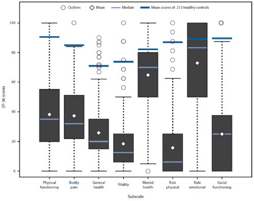
Box and whisker plots, also known as box plots, provide a visual summary of data distribution. Here's what you need to know:
- The plot is divided into four main parts, each representing 25% of the data.
- The "whiskers" (the T or ⊥ symbols) show the minimum and maximum values.
- The box represents the middle 50% of the data.
- The line inside the box is the median.
- The bottom of the box is the first quartile (Q1), and the top is the third quartile (Q3).
Understanding these components will help you answer questions about data spread, central tendency, and outliers.
Stem and Leaf Plot

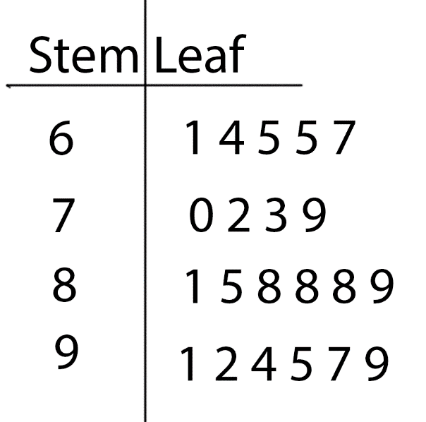
Stem and leaf plots are likely the least taught out of all these charts and tables on this page. They're a representation of numbers by two components: stems and leaves. The tens digit (or hundreds, or thousands) is split off in the "stem." Then, every single lower digit (here, the ones) is put into a leaf.
The mistake most students make on stem and leaf plots is not understanding that each of the ones represents an individual value. In the chart below, we have 61, 64, 65, 65, 67.
Frequency Chart
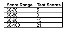
As compared to the box and whisker/stem and leaf plot, above, most students are familiar with frequency charts. However, beware. When you get one of these questions, the ACT® is almost definitely trying to trick you. Look at the example below to understand why.

Question:
How many students scored between 81-90?
- A) 5
- B) 6
- C) 9
- D) 12
Click for the Answer
Correct Answer: B. 6
Explanation:
To solve this, we need to think critically about the data presented. The chart doesn't directly give us the 81-90 range, so we need to deduce it:
- We know there are 15 students scoring 60-90.
- There are 9 students scoring 60-80.
- To find students scoring 81-90, we subtract: 15 - 9 = 6
Therefore, the correct answer is 6. This question demonstrates how the ACT® tests your ability to interpret data and make logical deductions.
Venn Diagrams
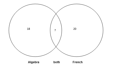
While you might expect to see traditional Venn diagram images, the ACT® Math section often presents these concepts in word problems. Here's an example:

Question:
There are 30 students in total. 18 are in Algebra, and 20 are in French. How many students are in both classes?
- 8
- 10
- 12
- 14
Click for the Answer
Correct Answer: A. 8
Explanation:
To solve this:
- Calculate the total if no students were in both: 18 + 20 = 38
- Subtract the actual total: 38 - 30 = 8
So, 8 students are in both classes. This problem demonstrates how Venn diagram logic applies to real-world scenarios, even without a visual representation.
Conclusion
Mastering these table types - box and whisker plots, stem and leaf plots, frequency charts, and Venn diagrams - is important for success on the ACT® Math section.
